10 Ways SamCart Will Increase Your Checkout Page Conversions
SamCart,
a new SaaS product for digital marketers is something we’re really
excited about. The brainchild of a very successful internet marketer,
Brian Moran, of “Get 10,000 Fans”,
SamCart was built from the ground up to be a tool internet marketers
could count on to help move people through their funnels and close
sales.
Starting with
just Brian, his brother Scott and a couple of contractors, they have
grown SamCart to a team of 15 and they are helping over 5,000 small
businesses sell more of their stuff online.
Below, I will outline some of the best ways using SamCart has increased our conversions and why it’s our online shopping cart of choice!
10 Ways SamCart Will Increase Your Checkout Page Conversions
#1. Templates Library of High Converting Themes
 We
know a robust template library is super important for any business
marketing online. While it is still in the early stages, SamCart
features a template library of high converting checkout and upsell
designs.
Each of their
templates is hand designed by marketing professionals with years of
experience in online sales and a great understanding of what sells in
today’s online environment.
One awesome
benefit of this is that as our customers use the various templates, we
are able to see what works and doesn’t as they push traffic and
conversions through the pages.
Basically, the
more users and sales we move through SamCart, the more data we can
gather on what’s working and what isn’t, and the better the product will
become.
#2. One Click Upsells
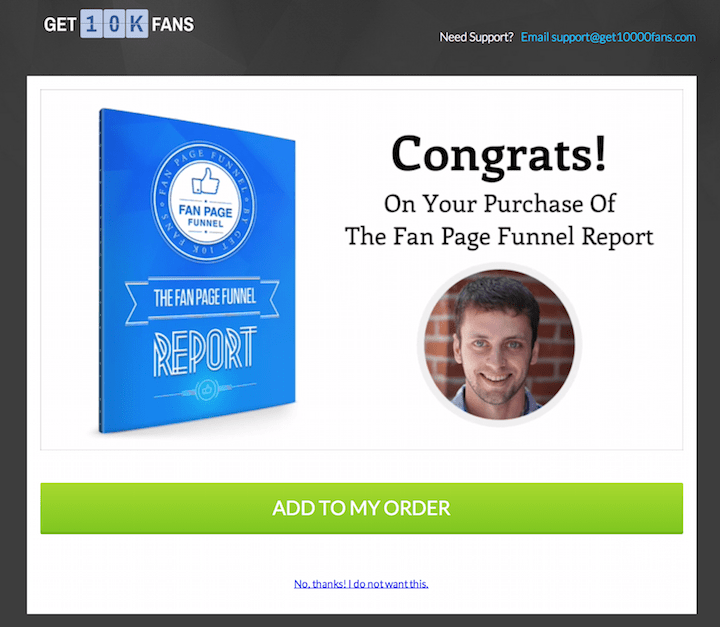
One of the
biggest differences between SamCart and other checkout services is they
offer something that no one else in the market does. One click upsells.
What this means, is that after visitors have checked out on their first
product, they can be presented with a series of upsell products that
take a single click to buy and do not require any additional
information.
One of their brands (Get 10,000 Fans)
uses these upsells to turn $10.00 report sales into an average $50.00
in sales per customer. They do this by offering a smaller $10.00 product
on the front end, and then upsell a more expensive product or two that
compliment the needs the first product filled.
#3. Variable Elements
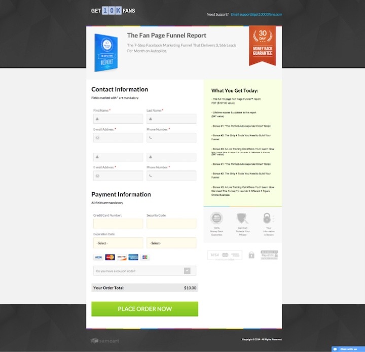
The majority of
the elements on their checkout pages and upsells are customizable. What
this means for you as a user is that it is incredibly easy to set up
high impact split tests, as we’ll discuss in the next point.
#4. Split Testing

Proper split testing is a critical piece in optimizing a funnel.
Most successful
digital marketers split test every single thing that they can. And now
you can split test your checkout cart and upsells. SamCart supports
split testing on both your checkout pages, and your upsell funnels.
What this means
for your business, is that if you are wondering, “Will a $97.00 product
convert differently than a $197.00 product?”, you can split test the
funnels. Meaning, half of your traffic will flow through one upsell
process, while the other half uses another. One powerful insight we
found from this was that our $97.00 upsell had the exact same conversion
rate as the same product at $197.00. This nearly doubled our customer
value.
#5. Mobile Responsive
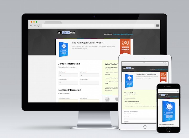
As many of you
know, mobile traffic has been becoming a bigger and bigger part of your
web traffic over the last 10 years. While this is great in that people
are accessing you more frequently, from more places, it comes with its
own set of challenges. The primary challenge, is that many websites and
in particular, checkout options, do not play well with mobile devices.
Where SamCart
addresses this is that all of our checkout and upsell funnels are mobile
optimized. You will never lose sales because someone is trying to act
quickly on an email offer they just received on their mobile. They are
routinely seeing their customers improve overall conversion rates by
10-30% by having mobile ready checkouts.
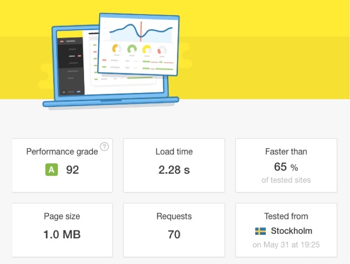
#6. Quick Page Loads
Attention spans are shorter than ever. That’s why they prioritize
a quick page load experience. What this does for your users is that it
makes movement through the funnel as smooth as possible. We don’t want
people getting distracted waiting for things to load. We want to make
the most of the excitement we generate!
If page load time is an issue for you, I also highly recommend you check out MaxCDN.
#7. Branded Checkout Page Experience
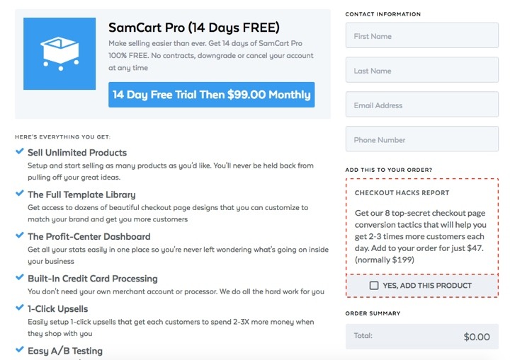
Users who make
it to a checkout page are sometimes presented with a page that looks
nothing like what they have been experiencing up to this point with your
brand. This can be a little bit jarring, and risks sucking a bit of the
excitement out of them that you have worked so hard to maintain
throughout your advertising campaign and funnel.
Where SamCart
can help with this is that every one of their landing page templates is
customizable, and designed to convert. No more generic carts, now your
shopping cart can be as much a part of your marketing strategy as every
other piece.
#8. Guarantees
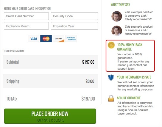
Every SamCart
checkout page comes with a section to post whatever guarantee you may
have. This helps give your future customers a sense of security because
if you are willing to refund them or have a similar guarantee, you are
willing to stand behind your product.
Here’s a good article explaining the power of guarantees on conversion rate.
#9. Bonus Section

As we in the
digital marketing space know, having the right bonuses with your
products can make or break an offer. That’s why the SamCart checkout
pages are built with this specifically in mind. We want you to be
building value for your customers from the the very first exposure, all
the way through their purchase.
Each checkout
page comes with a prominent section dedicated to reiterating your
offers. Just think about a possible customer sitting in your checkout on
the fence. Oftentimes, a reminder of what a great product and offer
they are getting can be enough to get them to click that final submit
button.




No comments
Post a Comment